Industry
Women's Health
Year
2025
Client
Capstone: Girl Gummy
Women's Health
Girl Gummy


Industry
Women's Health
Year
2025
Client
Capstone: Girl Gummy
Girl Gummy: Women's Health Gummy E-commerce Platform
UX/UI Design Case Study
Project Type: Google UX Design Capstone
Role: UX/UI Designer
Timeline: 12 weeks
Platform: Responsive e-commerce website
Tools: Figma, research synthesis, prototyping, usability testing
Goal: Build a trustworthy shopping experience for women’s health gummies through education, personalization, and simplified checkout
Challenge:
Design an e-commerce platform specifically for women's health gummy vitamins that builds trust, educates users, and simplifies the purchasing process while addressing unique concerns around women's wellness needs.
Solution:
A user-centered e-commerce platform that combines educational content, and streamlined purchasing with a focus on transparency.
Project Introduction
Embracing Focus Over Scale
Girl Gummy marked an important shift in my UX/UI design journey. As my second capstone project, I intentionally chose a smaller project scope so I could focus more deeply on quality, usability, and visual refinement.
This project allowed me to strengthen my design process by moving beyond aesthetics and focusing on how users discover products, build trust, and make confident purchasing decisions within a responsive e-commerce experience.
The Learning Curve
Girl Gummy helped me shift from visual-first design toward user-centered product thinking. I focused on reducing visual clutter, strengthening hierarchy, and using research to guide decisions around product discovery, education, and checkout trust.
Research Phase
Market Analysis
Market Size: $4.2B women's supplement market growing at 8.1% annually
Key Competitors: Olly, SmartyPants, Ritual, Care/of
Market Gaps: Lack of personalized recommendations, insufficient educational content, complex subscription models
User Research & Validation Methods
Informal User Feedback
Gathered feedback from a small group of family and friends to understand first impressions, navigation clarity, product trust, and ease of use.
Competitive Analysis
Reviewed three wellness and e-commerce platforms to identify common patterns around product education, personalization, checkout flow, and brand trust.
Prototype Testing
Tested the responsive prototype to observe how users moved through product discovery, key content sections, and the shopping experience.
Design Iteration
Used feedback to refine visual hierarchy, simplify product information, strengthen calls to action, and improve the mobile browsing experience.
User Personas


User Journey Mapping
Customer Journey: First-Time Purchase

User Stories
Epic: Product Discovery & Education
As a health-conscious woman, I want to understand which gummy vitamins are right for my specific needs so that I can make an informed purchase decision.
User Stories:
As Sarah, I want to take a personalized quiz so that I can receive tailored product recommendations
As Mariah, I want to see clear ingredient lists and safety information so that I know products are safe while breastfeeding
As Lil, I want to access scientific studies and certifications so that I can verify product efficacy
As a user, I want to read authentic reviews from women with similar needs so that I can trust the product will work for me
As a user, I want to understand the benefits of each ingredient so that I can choose products that align with my health goals
Epic: Seamless Purchase Experience
As a potential customer, I want a simple and trustworthy checkout process so that I can confidently purchase the right products for my needs.
User Stories:
As a user, I want flexible subscription options so that I can choose delivery frequency that works for my lifestyle
As Maria, I want guest checkout options so that I can purchase quickly during limited free time
As a user, I want transparent pricing with no hidden fees so that I can budget appropriately
As a user, I want multiple secure payment options so that I can pay using my preferred method
As Jennifer, I want to easily modify my subscription so that I can adjust products as my needs change
Affinity Mapping Results
Key Themes from User Research
Visual Trust & Brand Credibility
Users wanted the brand to feel playful, but still polished enough to trust with wellness-related products. Visual design, product photography, ingredient details, and clean layout all played a role in building confidence.
Clear Product Benefits
Users needed quick access to what each product does, who it is for, and why it matters. The product pages needed to explain benefits in simple, scannable language without overwhelming the shopping experience.
Confidence Before Checkout
Users wanted reassurance before making a purchase. Clear pricing, subscription details, product reviews, ingredient information, and return/support details helped reduce hesitation.
Wireframes & Prototyping

Responsive Design Approach
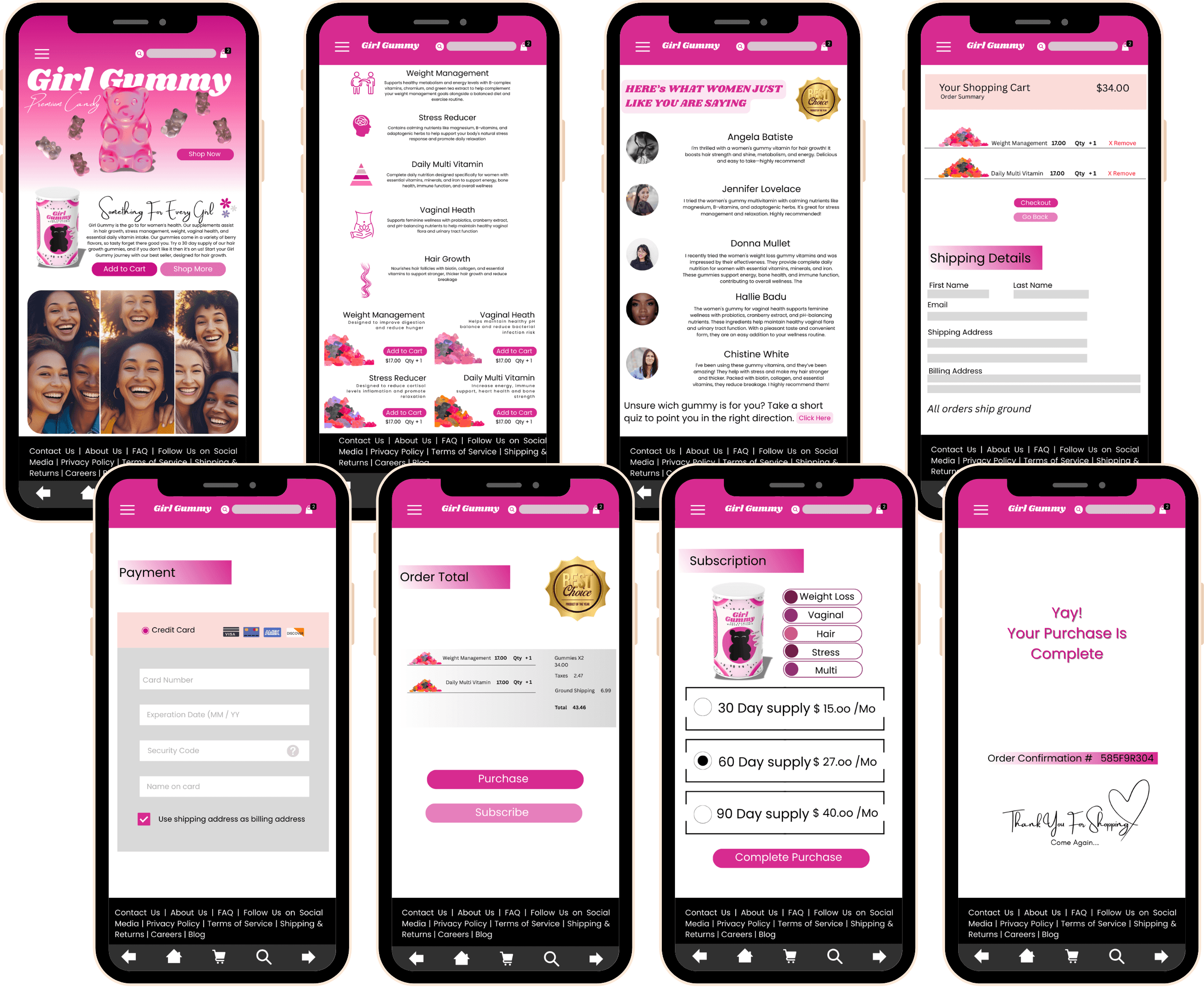
Girl Gummy was designed as a responsive e-commerce experience across mobile, desktop, and tablet. Each layout was adapted based on how users are most likely to browse, research, and purchase wellness products on different devices.
Mobile Experience: Quick Purchase Path
The mobile layout uses a single-column structure optimized for thumb navigation. Product information, quantity controls, and checkout actions are simplified to support faster decision-making on smaller screens.
Desktop Experience: Product Discovery
The desktop layout uses a larger hero image, clear navigation, and prominent calls to action to create a stronger first impression. This version supports users who want to explore product categories, compare options, and review educational content before purchasing.
Tablet Experience: Planning Mode
The tablet layout bridges mobile convenience with desktop-level detail. It gives users more space to read product information, compare benefits, and browse wellness content without overwhelming the interface.


Visual Design System
Color Palette
Primary: Vivid Pink (#E93682) - Different, New, Fun
Secondary: Pastel Crimson (#EC8BA4) - Feminine, approachable, energetic
Accent: Dark Neon Pink (#5B0D4C) - Luxury, Premium
Neutral: White (#FFFFFF) - Clean, minimal, premium feel
Text: Black (#000000) - Readable, professional
Typography
Headings: Shrikhand (Modern, fun, approachable)
Body Text: Poppins (Highly readable, clean, professional)
Accent: Amsterdam Two (Feminine touch for testimonials)
Component Library
Buttons with rounded edges for soft inviting touch
Card designs for clean modern approach
Badge system for certifications and benefits
Modal designs for detailed product information
Usability Testing Results
Testing Methods
Usability testing helped validate the product discovery, quiz, product page, and checkout flows. Key improvements included clearer subscription terms, stronger ingredient education, and a simplified mobile checkout experience.
Areas for Improvement:
Subscription terms needed clearer explanation (addressed in final design)
Some users wanted more detailed ingredient information
Mobile checkout flow needed optimization
Search functionality could be enhanced
Iterations Made
Clarified Subscription Model: Added detailed FAQ section
Improved Mobile Experience: Simplified checkout steps and optimized form fields
Technical Considerations
E-commerce platform (Shopify Plus)
Customer review system (Yotpo)
Email marketing (Klaviyo)
Analytics and heat mapping (Google Analytics, Hotjar)
Customer support chat (Zendesk)
Results & Validation
Because Girl Gummy was a capstone project, success was measured through informal prototype testing and design feedback rather than post-launch business performance.
I tested the responsive prototype with a small group of family and friends to observe how easily users could explore products, understand the brand, navigate between screens, and move through the shopping experience.
Key Insights
Users responded positively to the playful visual identity and felt the brand was memorable.
Product education needed to be clear and easy to scan, especially for wellness-related products.
The mobile layout needed strong visual hierarchy so users could quickly understand the product and take action.
Users wanted pricing, benefits, and product details to be easy to find before committing to checkout.
The quiz and product discovery experience helped make the shopping flow feel more personalized.
Design Improvements
Based on feedback, I refined the layout hierarchy, simplified product sections, strengthened calls to action, and made the mobile experience easier to scan. These updates helped create a clearer path from product discovery to purchase while keeping the brand experience playful, trustworthy, and easy to use.
Lessons Learned
What Worked Well
User-Centered Approach: Extensive research led to targeted solutions
Iterative Design: Regular testing and refinement improved outcomes
Focus on Trust: Transparency and education were key differentiators
Areas for Future Improvement
Personalization Engine: AI-driven recommendations based on user behavior
Expanded Content: More educational resources and expert consultations
Add customer testimony and reviews
Scalability Considerations
Design system needs expansion for new product categories
International expansion requires localization considerations
B2B features for healthcare provider partnerships
Next Steps & Recommendations
Phase 2 Development Priorities
Enhanced Personalization: Machine learning recommendations
Community Platform: User forums and expert Q&A
Subscription Optimization: Flexible pause/resume options
Educational Content: Video tutorials and
Long-term Vision
Position Girl Gummy as the premier destination for women's supplement education and purchasing
Expand into related wellness categories
Build strategic partnerships with healthcare providers
Develop proprietary health tracking and recommendation algorithms