Industry
Logistics
Year
2026
Client
Vittlez Delivery App
Delivery App
Vittlez

Industry
Logistics
Year
2026
Client
Vittlez Delivery App
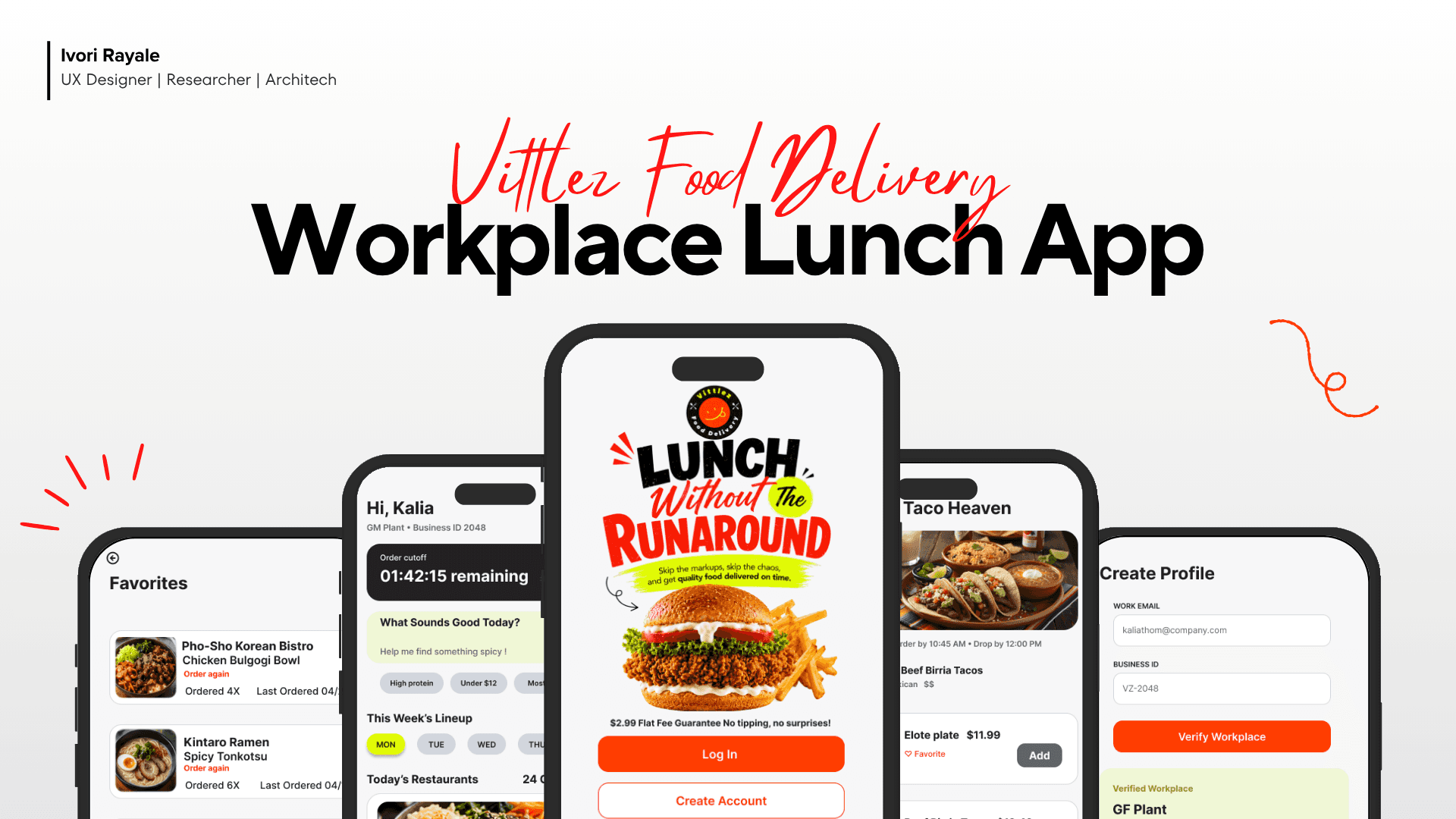
Vittlez: Workplace Lunch Delivery App
UX/UI Design Case Study
Project Overview
Client: Vittlez
Project Duration: 9 weeks
Role: Lead UX/UI Designer and Researcher
Tools: Figma, Figjam, Opensource AI
Project Introduction
Vittlez is a workplace lunch delivery concept designed for employees who want affordable, predictable, and easy lunch options during the workday. Unlike traditional delivery apps, Vittlez uses curated daily restaurant lineups, order cutoff times, flat-fee pricing, and drop-zone pickup to make lunch feel easier and less expensive.
The Problem
Workplace lunch delivery is often expensive, overwhelming, and unpredictable. Employees face hidden fees, too many options, unclear delivery timing, and limited planning support during short lunch breaks.
Research Goals
Understand how employees currently order lunch at work.
Identify frustrations with fees, timing, and delivery reliability.
Explore whether pre-ordering and flat-fee delivery would feel valuable.
Learn what would make workplace food delivery feel easier and more trustworthy.
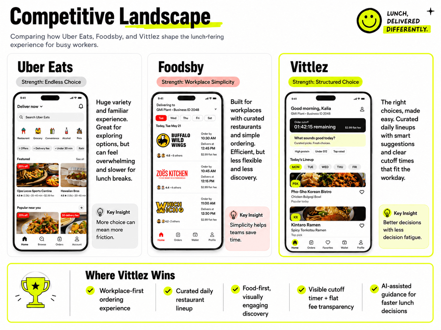
Competitive Analysis
During my research I was able to gain key insights on three different apps, including Vittlez. Uber Eats proves that more choices can cause friction. Foodsby helps the customers order faster but lacks in inspiration, and Vittlez reduces decision fatigue without sacrificing choices.
Research Phase
Before diving into UI design, I wanted to understand the real-world experiences of food delivery users. I launched a primary research survey to investigate current market frustrations, specifically focusing on cost sensitivity and mobile accessibility.
To gauge fee sensitivity, I asked users about their checkout abandonment habits, their overall satisfaction with current fee structures (on a 1–5 scale), and how inflation or cost shifts have impacted their ordering frequency over the last year. Additionally, to understand mobile behavior, I had participants rate their overall comfort level using smartphone delivery apps on a scale of 1 to 5. I have listed some of the questions from the survey below.
Fee Sensitivity:
Have you ever abandoned a food delivery order at checkout due to fees? If yes, how often?
How satisfied are you with the fees charged by the delivery apps you currently use (on a scale of 1–5)?
Have you changed how often you order delivery in the past year due to cost? If yes, how?
Tech Comfort & Mobile Behavior:
How comfortable are you using food delivery apps on your smartphone (on a scale of 1–5)?
Please analyze my affinity map to extract deeper insights into the pain points and behaviors of everyday food delivery app users

Design Opportunities
Based on research findings I have concluded the following as design opportunities.
Countdown timer for order cutoff
Curated weekly restaurant lineup
AI-assisted meal discovery
Vittlez Drop Zone pickup
Simple order tracking
Transparent flat-fee pricing
Deep Dive
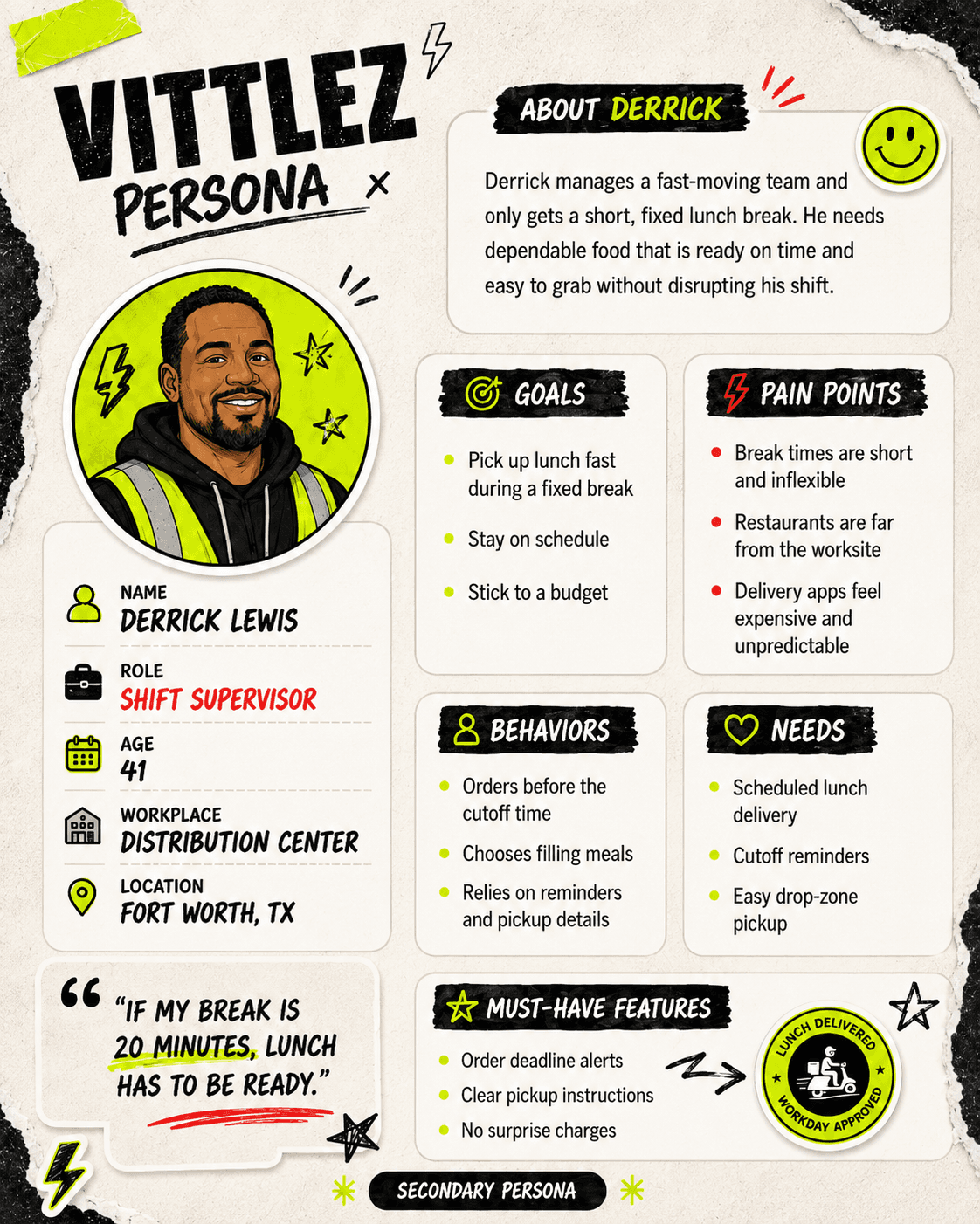
To better understand the target audience and design with intent, I developed two user personas representing our core user base. These personas represent the behaviors, needs, and pain points of the everyday delivery app user.

Mapping The User Journey
Below is a journey map illustrating a user's experience with a traditional food delivery app. When an order is delayed, it creates a major friction point, completely disrupting their "happy path" and causing frustration.
How Vittlez Solves This: Unlike typical delivery apps, Vittlez optimizes the experience by planning and dropping off lunch batches at specific times and designated locations daily. By eliminating the unpredictability of traditional delivery models, we prevent delays, reduce logistical issues, and drastically improve the overall customer experience.

On top of much improved service, I prioritized smooth navigation through the app.
The Vittlez System
Foundations for Growth
As an emerging food delivery platform, Vittlez requires a digital ecosystem that can evolve overnight. This design system serves as the structural framework bridging UX design and frontend development. Engineered for a lean team, it provides an atomic library of accessible, modular components. By standardizing our UI patterns from day one, we reduce cross-functional friction, streamline the developer handoff, and ensure that every new touchpoint feels like the same cohesive brand.

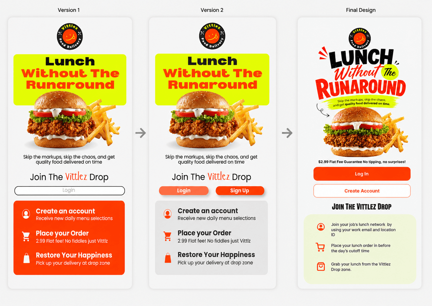
Crafting a Bold First Impression
For the welcome screen, my goal was to make a definitive statement. The Vittlez brand is inherently bold, and the opening experience needed to reflect that energy.
Through a process of trial and refinement, I moved away from an initially over-stimulated, "loud" layout toward a more mature, balanced design. This final composition set the tone for the entire platform: it provides a grounded, trustworthy foundation for the user experience, while still leaving room for small, delightful moments of brand playfulness throughout the journey. The first 2 designs felt a bit too serious. On the final design I made my mind up on what I wanted to focus on, the energy I wanted to give, and the creativity I wanted to show.
Design Decisions


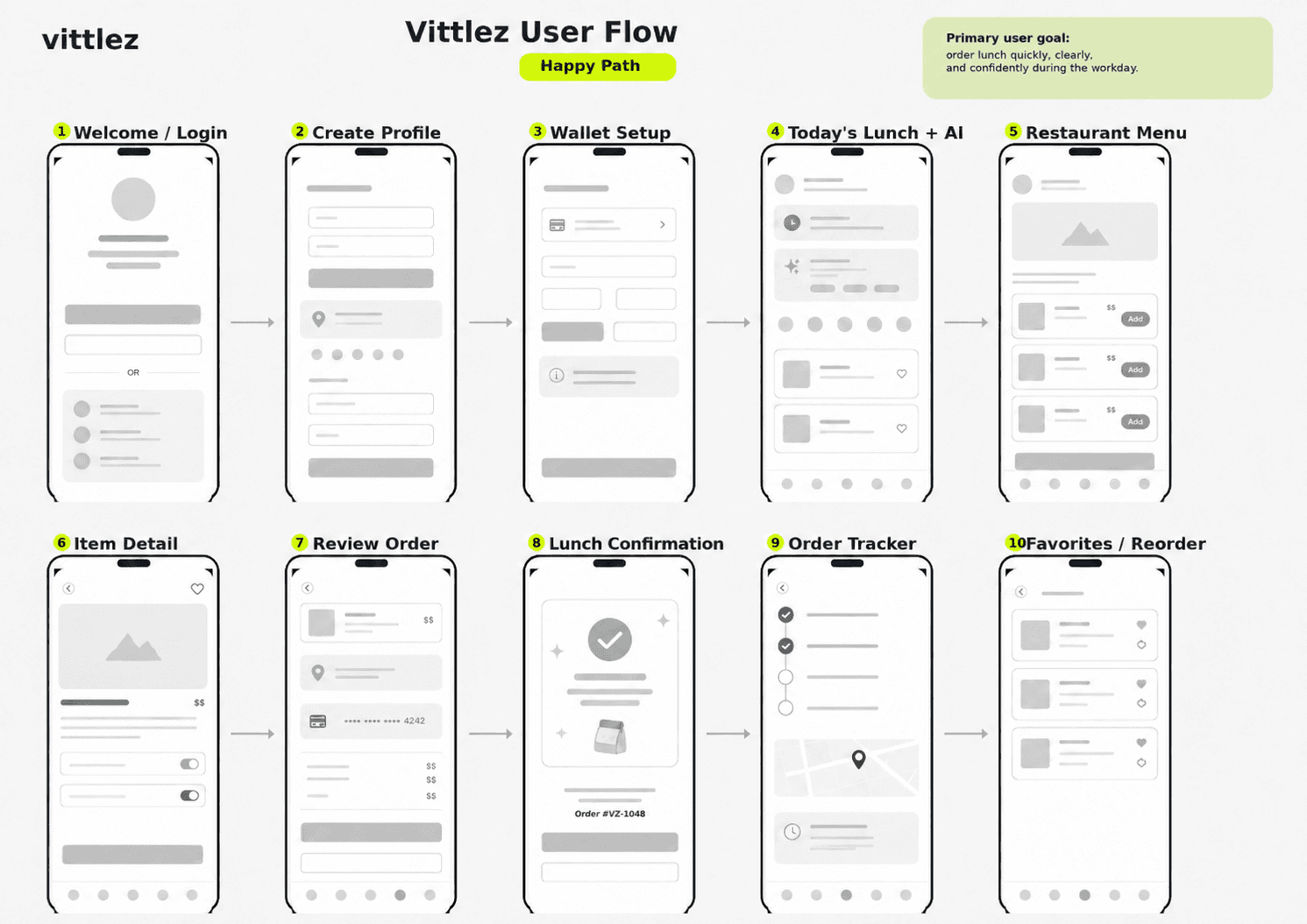
App Design Screens Overview
The Vittlez app was designed to make workplace lunch ordering faster, clearer, and more predictable for busy workers.
The experience begins with a bold welcome screen that introduces the brand’s energetic personality and clear value: quality lunch without the runaround. Users then create a profile, verify their workplace, and set up payment so future orders feel quick and simple.
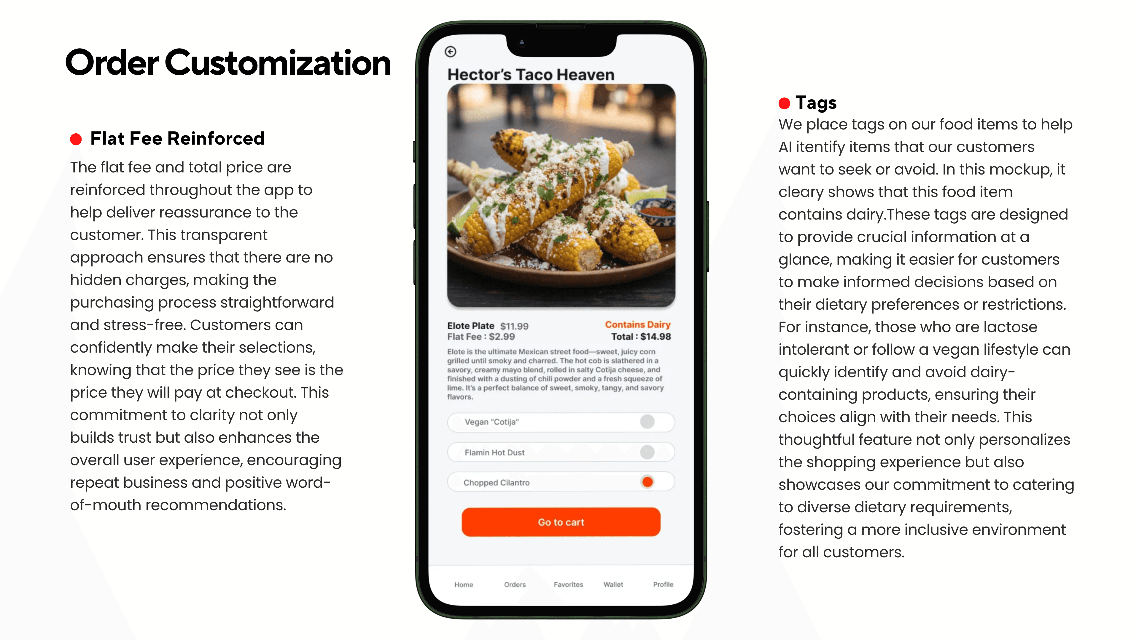
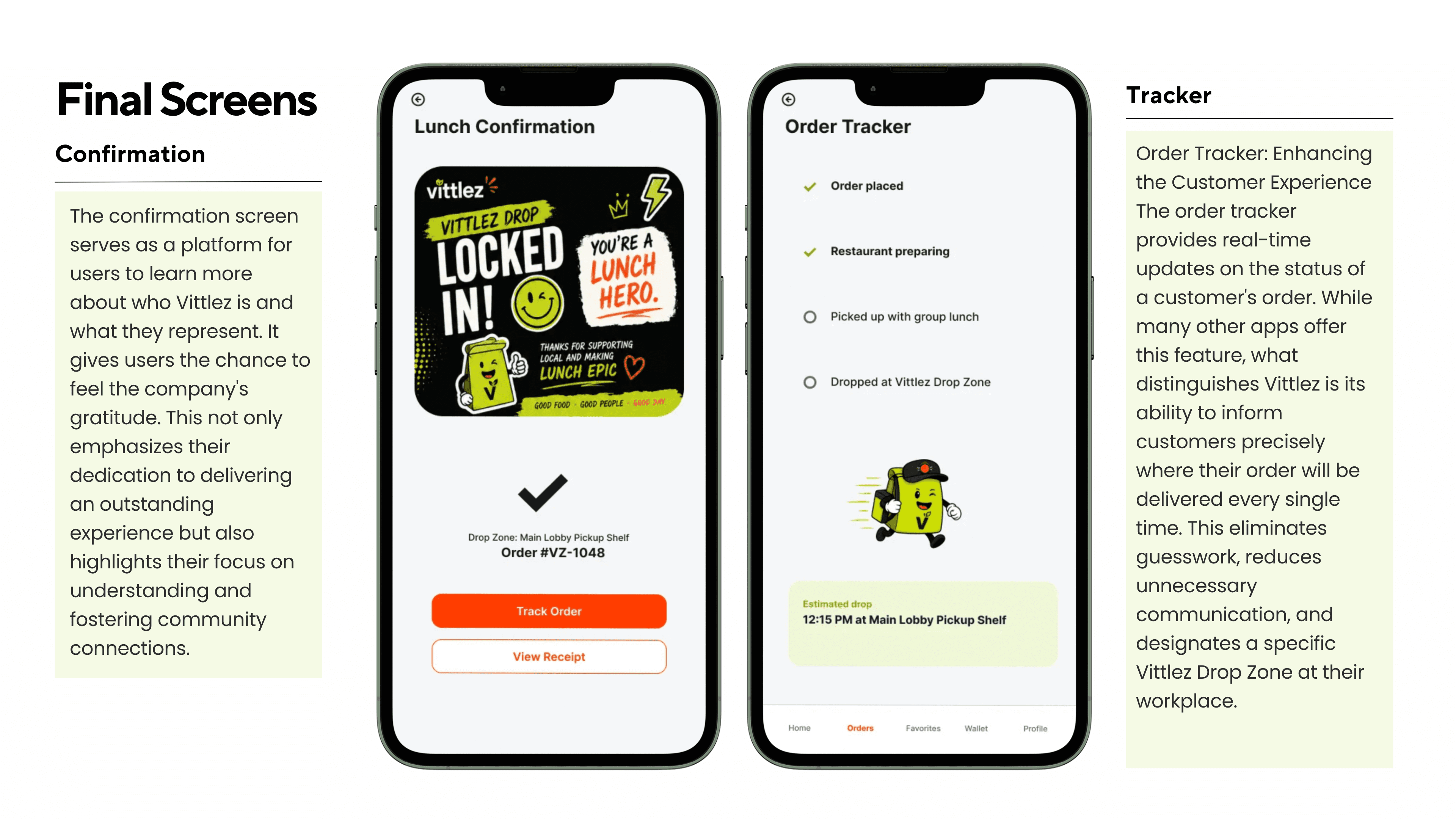
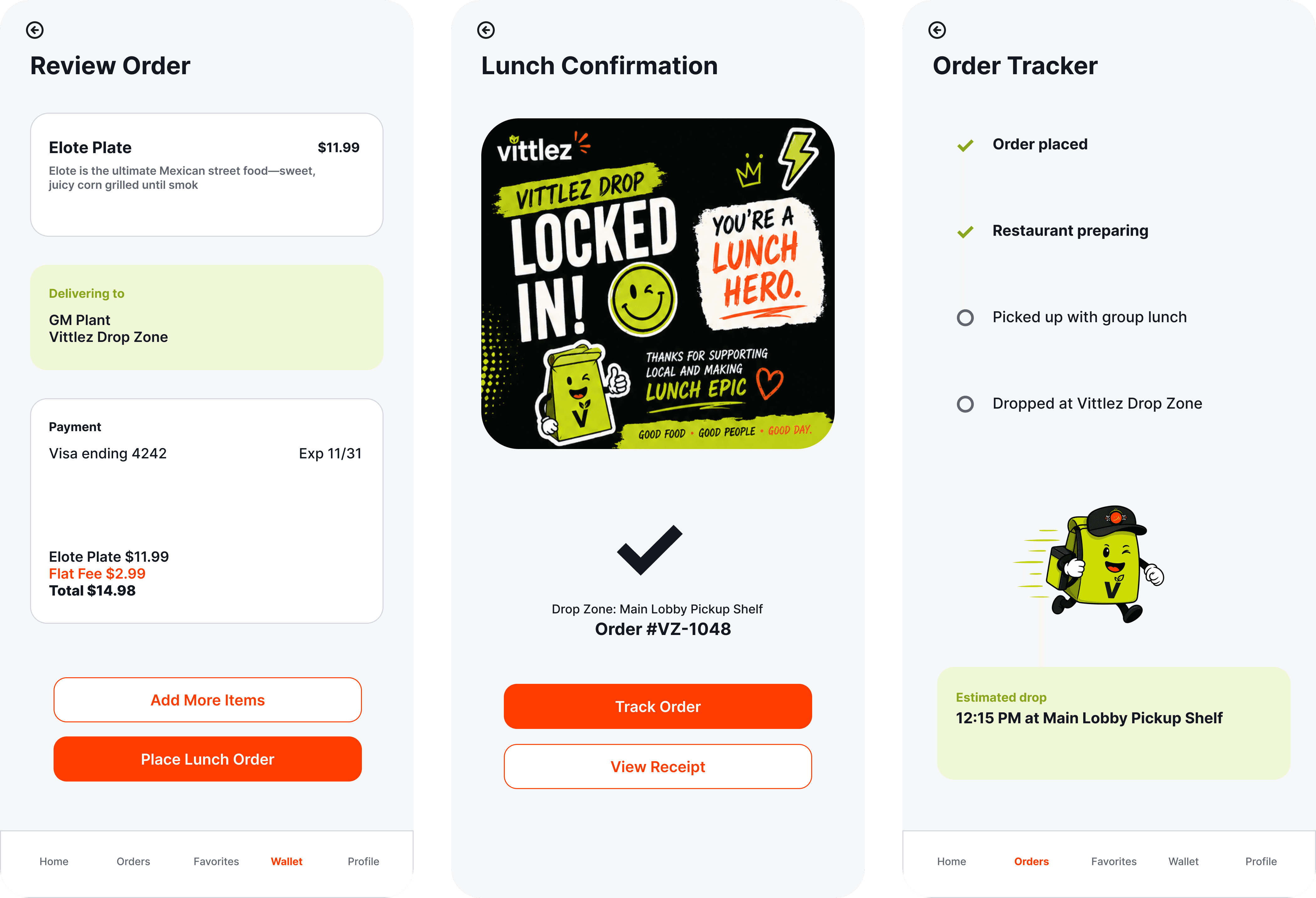
The main ordering screens focus on curated daily restaurant options, visible cutoff times, flat-fee transparency, and easy pickup details. Instead of overwhelming users with endless choices, Vittlez helps workers make faster lunch decisions with confidence.
Together, the screens create a workplace-first lunch experience built around speed, clarity, and convenience.


Please find the link to the Vittlez prototype below
Accessibility & Inclusive Design
Auditing Vittlez for accessibility was a major turning point in my design process. I realized that my initial visual choices tested the boundaries of inclusive design rather than prioritizing standard usability.
After evaluating button sizes, typography scales, and color contrast, I identified key areas for improvement. Specifically, our brand's vibrant neon green presents a significant contrast risk for text readability, and certain icon hierarchies push the limits of accessibility guidelines. I made some small changes for improvement, however this evaluation taught me an invaluable lesson. Accessibility cannot be a post-launch afterthought; it must be the foundation of my discovery and initial wireframing phases in all future projects.
Reflection
Every design decision tells a story — and in building this app, I made sure that story was one worth trusting.
The framework didn't come together by accident. It was built with deliberate focus, each challenge addressed in sequence, each discovery informing the next. But of all the choices made throughout the process, it was the smallest one that carried the most weight: a commitment to radical transparency. Price visibility wasn't treated as an afterthought or a checkout formality. It was woven into the experience from the first tap — carried through the ordering screen, the item selection, and into the final review. That consistency communicates something no marketing copy can manufacture: we said what we'd charge, and we meant it.
Aesthetics can differentiate a product. Trust sustains it.
That philosophy shaped every layout decision as well. The goal was never simply to look different from competitors — it was to feel different. To design an experience that guided users through the happy path with confidence and clarity, that acknowledged their needs without making them ask twice. The challenge was threading a narrow needle: introducing something fresh without sacrificing the familiarity users depend on. The result was a deliberate blend — dynamic yet approachable, playful yet purposeful. An experience with its own identity. Distinctly Vittlez.
No process is without its lessons, and this one was no exception. Given the opportunity to revisit the early stages, more time would have been dedicated to exploration before execution. The most valuable insights came unexpectedly — a design stumbled upon, a pattern noticed in passing. Those moments revealed what a more open ideation phase could have unlocked. Instead, early concepts were held onto too tightly, and pivots that should have happened were delayed. It's a familiar truth in design: change one element, and the ripple effect demands you reconsider many others. So next time, I'll test the waters with a toe, before diving head first.
Future Roadmap & Next Steps
Moving into the next phase of development, my focus will split between refining the core user experience and expanding the platform’s ecosystem:
Visual Polish & Micro-Interactions: I plan to introduce subtle, intentional visual elements that elevate the brand's identity and implement advanced interaction design features to make the user experience feel more dynamic and responsive.
B2B Expansion (Restaurant Dashboard): To fully realize the Vittlez marketplace, the next logical step is designing a dedicated merchant-facing dashboard. This will allow restaurant partners to seamlessly manage incoming batch orders, track fulfillment, and coordinate with couriers.
