Industry
Social Media
Year
2025
Client
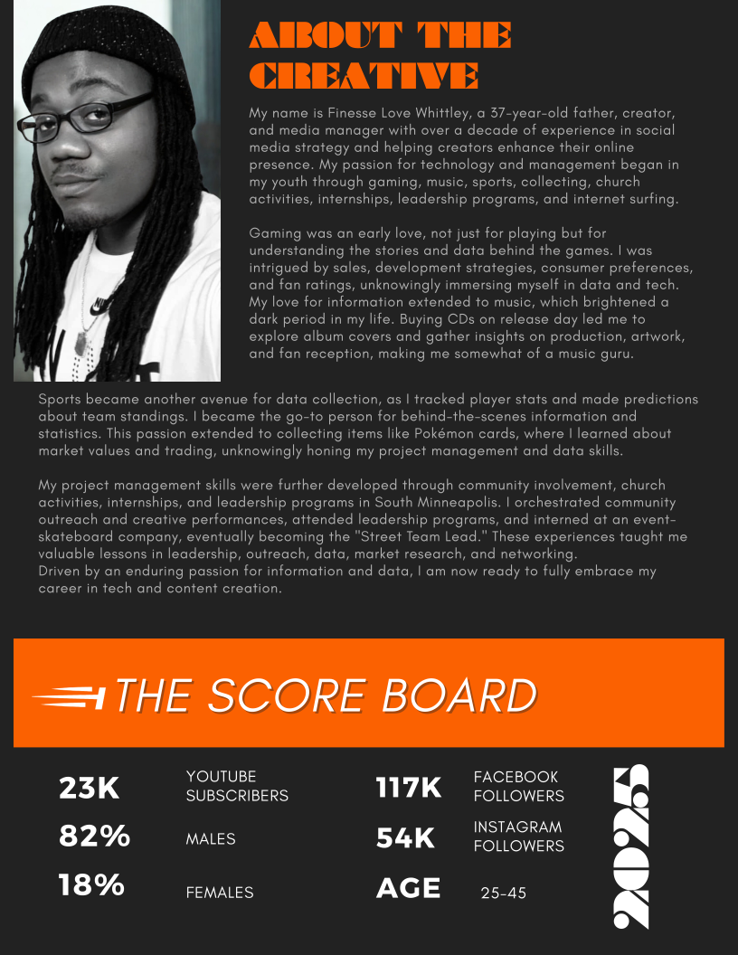
Finesse Whittley
Media
Finesse Dayly

Industry
Social Media
Year
2025
Client
Finesse Whittley
Project Overview
Finesse Dayly was a brand identity project created for a multi-platform content creator who needed a stronger, more consistent visual presence across social media, video, and streaming platforms.
My role focused on brand strategy, visual direction, template design, and creating a flexible identity system that could support different content types while keeping the brand recognizable and cohesive.
The Challenge
Finesse Dayly needed a brand system that could feel bold, authentic, and culturally relevant while still looking polished across professional and entertainment-focused content.
The main challenge was creating a flexible identity that could support multiple content categories without feeling scattered. The brand needed to work across social posts, YouTube graphics, video assets, and future platform growth.
The Solution
The solution for Finesse Dayly's brand identity challenge required developing a sophisticated yet authentic visual ecosystem that could seamlessly transition between hard news credibility and inspirational content while maintaining urban cultural relevance. The approach centered on creating a "Modular Authority System" - a flexible brand architecture that maintains core consistency while adapting to content context
Key Brand Solutions:
Use custom typography , consistent brand colors, visual hierarchy & custom templates
Color code content categories, Use flexible logo system, Apply adaptable templates
Incorporate street art, and urban photography & high contrast visual elements for vibrant energy
Professional elements for business content, and street elements for cultural content
Clean, organized aesthetic vs typical chaotic creator content
Primary Growth Challenges
Expanding Beyond Traditional Boundaries The fundamental challenge I faced was stretching beyond the familiar territory of UX/UI into the comprehensive ecosystem of business building. This wasn't just about designing interfaces anymore—I was architecting the entire foundation of a brand from inception to execution. This expansion required me to develop new competencies while maintaining my design expertise.
The Convergence of Content and Design A particularly demanding aspect was navigating the UI of content creation within the branding context. This challenge pushed me to think beyond static design elements and consider how content flows, evolves, and maintains consistency across multiple touchpoints. I wasn't just creating visuals; I was establishing a living, breathing brand system.
Managing Creative Complexity The sheer scope of coordinating brand voice, imagery, interfaces, and brand guidelines simultaneously presented a formidable creative challenge. Each element needed to harmonize while serving its distinct purpose—requiring me to balance artistic vision with systematic thinking.
Project Management as the Critical Catalyst
Orchestrating Multiple Workstreams
Project management became my essential framework for navigating this complexity. I discovered that creating cohesive brand rules wasn't just about design decisions—it demanded structured planning, timeline coordination, and resource allocation. This role forced me to think strategically about dependencies between brand elements and how changes in one area rippled through the entire system.
Intention as a Management Tool
My emphasis on intention reveals a sophisticated understanding of project management. Every design decision, content piece, and brand guideline needed purposeful justification. This intentionality became my north star for prioritizing tasks, making trade-offs, and ensuring all elements aligned with the overarching brand vision.
Consistency Through Systems Thinking
The project management challenge of maintaining consistency across diverse deliverables pushed me to develop robust documentation and governance processes. I learned that consistency isn't achieved through repetition alone, but through creating scalable systems and clear guidelines that others could follow—a core project management competency.
End-to-End Ownership
Perhaps most significantly, this project challenged me to own the entire lifecycle—from strategic conception through tactical execution. This holistic responsibility meant managing not just timelines and deliverables, but stakeholder expectations, quality standards, and the delicate balance between creative exploration and practical constraints.
This experience transformed me from a specialist focused on specific design outputs to a strategic thinker capable of orchestrating complex, multi-faceted brand initiatives. The project management skills I developed—particularly around maintaining intention and consistency across diverse workstreams—now position me as someone who can bridge the gap between creative vision and business execution.
Research & Discovery
Brand Audit & Competitive Analysis : Studied 3 prominent urban content creators including:
Trent Shelton - Focus on consistent theme with clean visuals, emotional depth
Derrick Branch -Authentic & down to earth, room for improvement on content format
Tyrone Magnus - Engaging content, high energy, humorous, content not polished
Key Market Insights:
Urban content creators often lack cohesive brand identity
Audiences respond to authentic, unfiltered personalities
Visual consistency increases audience retention by 23%
Multi-platform presence requires adaptable design systems
I created a full set of Instagram reel templates and story highlight covers that keep the Finesse Dayly brand looking cohesive across various platforms. The templates are designed to stay on-brand while still giving enough flexibility to work with different types of content - whether it's breaking news, motivational posts, or entertainment coverage.
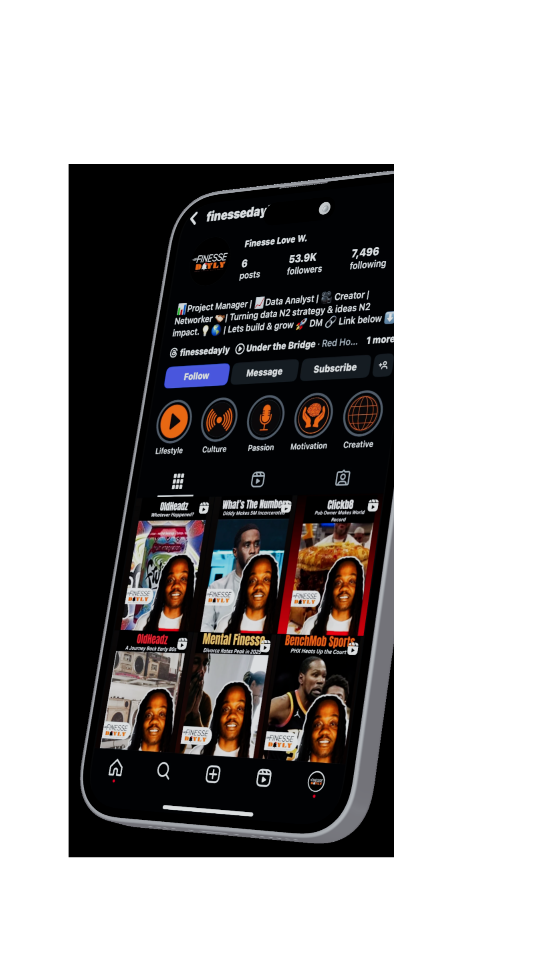
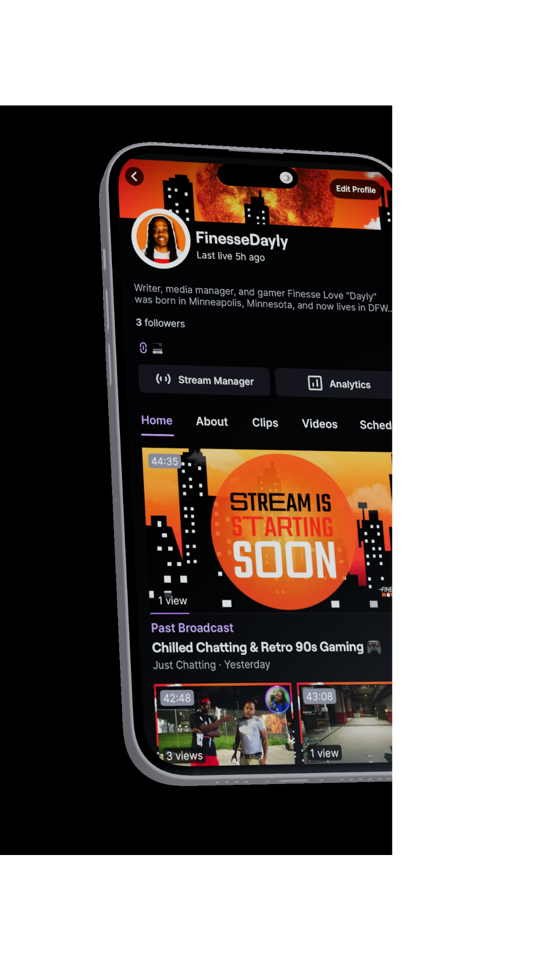
The brand carries over perfectly to other platforms too - you can see this in the streaming channel graphics in the second image. This means when someone sees Finesse Dayly content on Instagram, then jumps over to YouTube or Twitch, they instantly know it's the same creator. That recognition across platforms is huge for building a loyal following.
Target Audience:
Primary: Urban millennials (25-45) interested in culture and current events
Secondary: Gen Z (18-24) seeking authentic content and motivation
Tertiary: Creative professionals looking for industry insights

Brand Personality Development
Brand Archetype: The Sage + The Rebel
Knowledgeable yet approachable
Challenges status quo while providing wisdom
Street-smart with professional polish
Brand Voice:
Conversational - Talks with audience, not at them
Confident - Authoritative but not arrogant
Motivational - Inspiring and uplifting
Real - Authentic and unfiltered when necessary
Creative Strategy & Concept Development
Brand Positioning Statement
"Finesse Dayly is the authentic voice of urban culture, delivering unfiltered insights across sports, entertainment, and life while inspiring the community to level up their hustle."
Design Philosophy
"Urban Sophistication" The brand needed to bridge urban culture with a professional polish. Our approach combined:
Bold Typography - Strong, confident letterforms
Dynamic Color Palette - Energetic yet sophisticated
Authentic Imagery - Real people, real moments
Versatile Layouts - Adaptable across all content types
Concept Direction
Chosen Concept: "The Finesse Formula" Based on the idea that success comes from the perfect blend of style, substance, and strategy—the ultimate finesse.
Visual Metaphor: The intersection of urban culture and professional excellence, represented through clean geometric forms meeting organic, street-inspired elements.
Visual Identity System
Logo Design
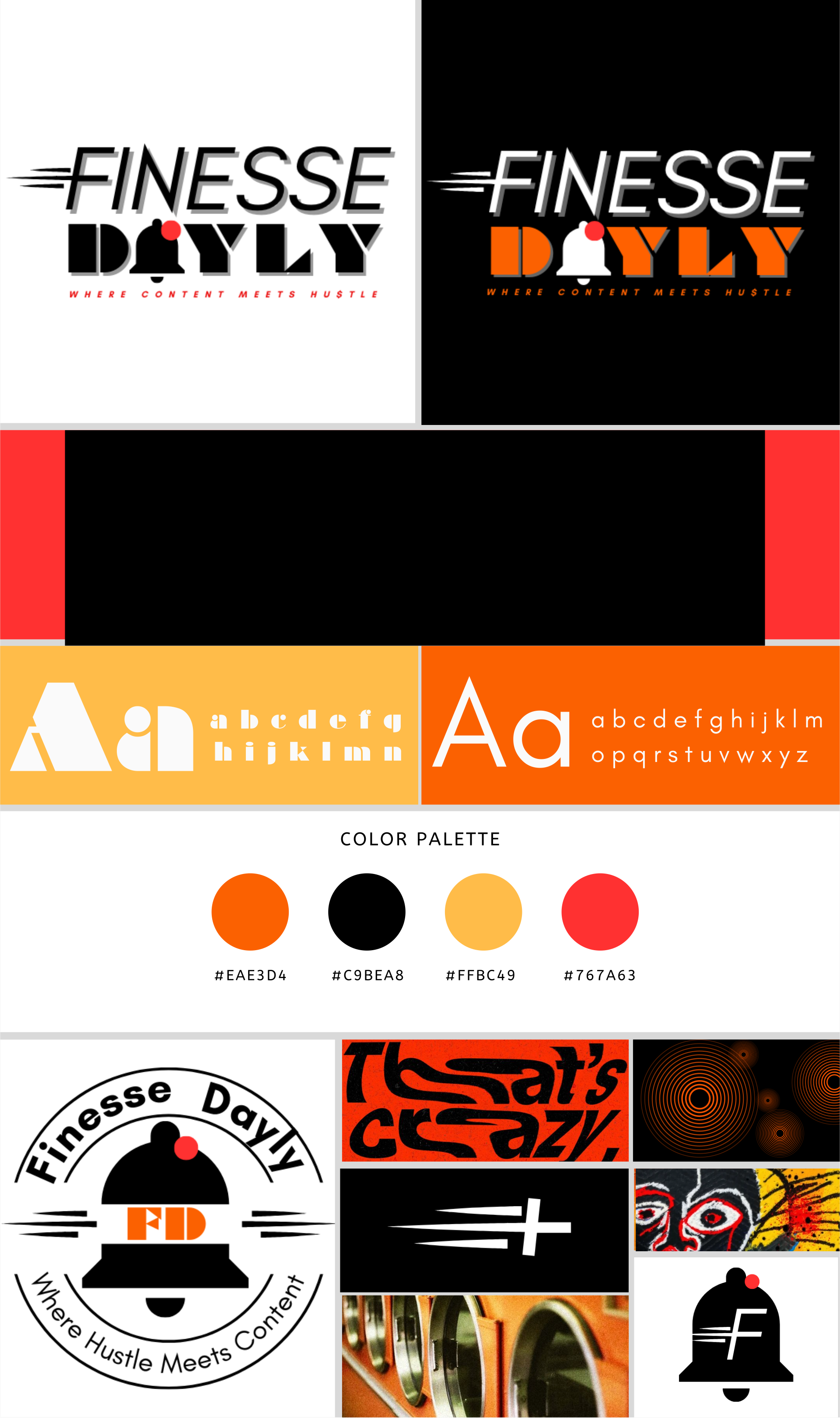
Primary Logo: Wordmark
Custom typography based on modified Glacial Indifference
Subtle geometric modifications for uniqueness
Strong, confident letterforms with urban edge
Works across all media sizes and applications
Secondary Logo: Monogram
Geometric construction with dynamic angles
Perfect for social media profile pictures and merchandise
Maintains brand recognition at small sizes
Logo Variations:
Horizontal layout for headers and banners
Stacked version for square formats
Icon-only version for profile pictures
Reversed versions for dark backgrounds
Typography System
Primary Typeface: Glacial Indifference
Headers, logos, and emphasis text
Bold, confident, highly legible
Excellent screen readability
Secondary Typeface: Antonio
Body text, captions, and descriptions
Clean, modern, accessible
Optimized for digital platforms
Accent Typeface: Braggadocio
Special headers and promotional content
Urban, street-inspired feel
Used sparingly for maximum impact
Brand Applications
Social Media Templates
Instagram Posts:
Quote Cards - Motivational content with brand typography
News Updates - Breaking news format with consistent layout
Behind-the-Scenes - Personal brand storytelling templates
Announcement Posts - New content and collaboration announcements
YouTube Thumbnails:
Reaction Videos - High-energy layout with expression focus
News Commentary - Professional layout with topic emphasis
Motivational Content - Inspiring visuals with strong typography
Collaboration Features - Multi-person layouts with brand consistency
We explored a few different directions for the YouTube cover before landing on the final design. The first version below was our take on Brutalism - bold, loud, and full of energy. But honestly, we realized that's what most content creators are already doing.
Since he's also a Project Manager, we wanted something that felt more polished and professional while still keeping that energy. It needed to show both sides of his brand - the creative content creator and the business-minded project manager.

The second design here was our attempt to keep that same energy but dial it back a bit. I stripped out all the topic-specific imagery because we didn't want to box him into just sports or entertainment - he needed the freedom to talk about whatever was on his mind.
This version had plenty of movement and visual interest, but something still felt off. It wasn't quite hitting the mark we were aiming for, so we decided to keep pushing and try something completely different

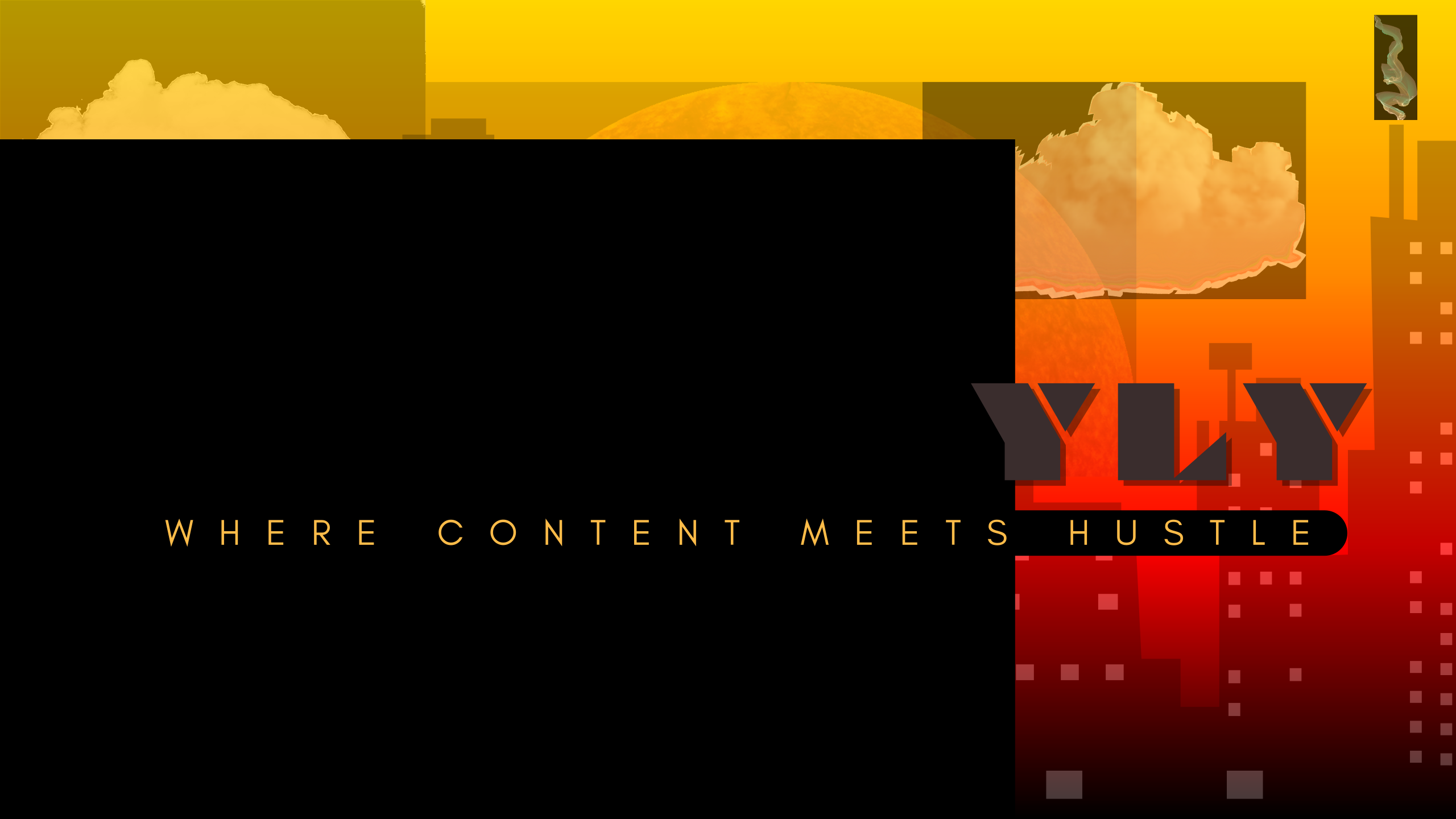
For the final design, we went back to the brand structure we'd established earlier. I created a city skyline backdrop that incorporates all the Finesse Dayly brand colors, and this one just clicked. It perfectly captures that mix of urban culture and young professional energy we were going for - much more cohesive than our previous attempts
Video Assets
Lower Thirds:
Clean, professional design for interview content
Animated entrance and exit transitions
Consistent with overall brand aesthetic
Intro/Outro Sequences:
5-second branded intro with logo animation
3-second outro with social media callouts
Music-synced motion graphics
Brand Guidelines & Standards
Logo Usage Guidelines
Do's:
Maintain minimum clear space (equal to the height of the "F")
Use approved color combinations only
Ensure adequate contrast on all backgrounds
Scale proportionally maintaining aspect ratio
Don'ts:
Stretch or distort the logo
Use unapproved color combinations
Place logo on busy backgrounds without proper contrast
Recreate or modify logo elements
Color Usage Standards
Primary Application:
Finesse Orange and Daily Black for maximum impact
Urban White for clean, professional presentations
Secondary Application:
Rush Red for call-to-action elements
Golden Yellow for community-focused content
Street Gray for supporting text and backgrounds
Implementation Strategy
Phase 1: Core Brand Launch (Week 1-2)
Logo implementation across all platforms
Social media profile updates
Basic template rollout
Phase 2: Content Integration (Week 3-4)
Video asset implementation
Thumbnail template deployment
Merchandise design finalization
Phase 3: Full Brand Activation (Week 5-6)
Complete brand guideline distribution
Team training and adoption
Brand consistency monitoring
Platform-Specific Adaptations
YouTube:
Channel art with brand consistency
Thumbnail templates for each content category
End screen branding elements
Instagram:
Story highlight covers
IGTV cover templates
Reels branding elements
TikTok:
Profile optimization
Video overlay templates
Hashtag strategy integration
Results & Impact
Finesse Dayly was a brand identity and creative strategy project focused on building a more cohesive, recognizable, and flexible visual system across digital platforms.
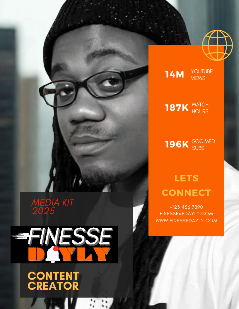
The final brand kit included a logo system, typography direction, color palette, social media templates, YouTube graphics, video assets, and usage guidelines. Together, these deliverables created a stronger foundation for consistent content creation across Instagram, YouTube, TikTok, and future brand extensions.
Key Outcomes
Created a cohesive identity system for a multi-platform content creator
Developed flexible templates for news, entertainment, motivational, and business content
Improved visual consistency across social media, video, and streaming assets
Established brand guidelines to support future content creation and platform growth
Balanced urban cultural relevance with a more polished, professional presentation
Lessons Learned & Evolution
Key Insights
Authenticity Balance: The biggest challenge was maintaining street credibility while elevating professionalism. The solution was keeping the core personality intact while refining the visual presentation.
Versatility Requirements: Urban content creators need extremely flexible brand systems due to diverse content types. Our modular approach allowed for consistent branding across various formats.
Community Connection: The urban audience values authenticity over perfection. Strategic imperfections and personality-driven elements were crucial for acceptance.
Future Brand Evolution
Planned Expansions:
Podcast Branding - Audio-specific brand applications
Live Event Graphics - Speaking engagement and appearance materials
Digital Products - Course and consultation branding
Team Expansion - Sub-brand development for team members
Long-term Vision: Positioning Finesse Dayly as a media brand rather than just a content creator, with potential for:
Network expansion opportunities
Licensing and merchandising growth
Speaking and consulting revenue streams
Community platform development
The Finesse Dayly brand identity successfully bridges the gap between urban authenticity and professional credibility. By creating a flexible, modular system that adapts to various content types while maintaining consistency, we established a strong foundation for long-term brand growth.
The project demonstrated that effective branding for content creators requires deep understanding of both the creator's personality and their audience's expectations. The resulting brand system not only improved recognition and engagement but also positioned Finesse Dayly for expanded opportunities in the media landscape.
Key Success Factors:
Authentic representation of creator personality
Flexible system accommodating diverse content
Strong visual hierarchy and consistency
Community-focused approach to brand development
Strategic positioning for future growth
This comprehensive rebrand transformed Finesse Dayly from a content creator into a recognizable media brand, proving that thoughtful design strategy can elevate personal brands to professional media company status while maintaining authentic community connections.
The Finesse Dayly brand identity represents the successful fusion of urban culture and professional excellence, creating a distinctive voice in the crowded content creator landscape.